All of the information you need to move off-campus in one place.

Providing end-to-end information to help students feel prepared to make this transition.

Living Off-Campus
Website Design

Client
University of Warwick
My Role
UX Design Lead, Product Owner
Team
Research, Product, Engineering, Marketing, Data
Timeline
October 2023 - September 2024
Tools
Figma, Miro, Microsoft Suite
The Background
Moving off-campus is in right now.
The University of Warwick is a world-renowned and diverse institution, home to over 29,000 students. For decades, a shared popular student experience for Warwick students has been to eventually move to live off-campus for an academic year in their student journey*.
*In 2023/24, ~15,500 UoW students sought private accommodation in the Warwick District, with the numbers increasing by ~2% each year.
The Problem
There's too much scattered information.
There are numerous University of Warwick websites that have been made over the years that provide ad-hoc information relevant to students who would like to live off-campus.
However there is too much information in many different places that students over the years have become lost on where to find the specific information they need to prepare.
The Solution
Pull it all into one place.
This problem presented an opportunity to centralise all essential information into a single, user-focussed website.
By mapping the entire student journey of living off-campus, the website solution provides a streamlined, intuitive experience that helps students access relevant information efficiently — reducing stress and confusion for students, and increasing student engagement with existing Warwick-owned support resources for the business.
What I Accomplished
Sticking everybody together.
I led the project as the UX Design Lead and Product Owner. I formed a working group with representatives from marketing, product, sales, engineering, data science, and various student experts. We met every two weeks to ensure the product met both business and user needs, and to share insight and ideas so we could all learn from each other.
I steered the day-to-day progress of the project within the UX team, prioritising design decisions over others based on user and stakeholder feedback, and other project constraints (i.e. time and resources).
I also regularly hosted design workshops and presentations for our team to showcase the work of my fellow designers to the working group. This helped them gain confidence in their design decisions and encouraged more collaboration, leading to great ideas —some of which were validated in the final product
You can read more about the business impact of the project, constraints and lessons I learned in the Project Review section.
Design & Management Process
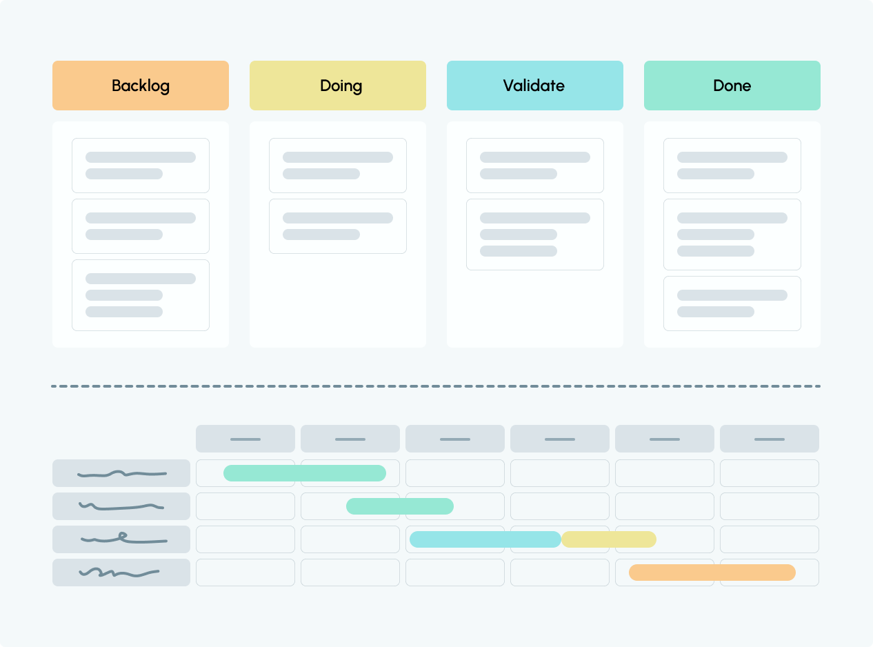
Design Thinking and Agile Methodology.
Our UX team focussed on using the Design Thinking Process to keep the product’s design data-informed on user insights.When working within our cross-functional team of product, marketing, regional, engineers, and other experts, I used the Kanban Agile Methodology and a full scale Gantt Chart to keep track of the entire project, and ensure our deliverables hit key deadlines.
User Research — Understand & Empathise.
“Is this microphone on?”
Over a month, I led and supervised our UX team talking to 104 students through semi-structured focus groups, with 3-4 students in each. There was a clear consensus that students were either unaware or overwhelmed by how long it takes to find the necessary off-campus support that they needed.
To start to understand our research, I started by producing a bank of user stories to represent all of the experiences talked about in the focus groups. Next, I created 4 different personas and user journey maps justified by the necessity to best represent the range of diverse experiences the students in the focus groups shared, and what they needed support for.
Defining The Problem - 4 Main Pain-Points
We needed to make information more accessible.
The results of our research made the following pain-points clear:
Difficulty finding useful information
Time-consuming search process
Overwhelm from disjointed resources
Uncertainty about completeness of information
Defining The Problem
Multidisciplinary team collaboration.
Humanising the problem was especially effective when communicating the problem to our stakeholders during working group meetings. My personas were particularly poignant in presentations, and they sparked more multidisciplinary team collaboration on what types of solutions could solve their pain-points.
Each meeting came with new insights, and together we generated how-might-we statements to transform core student problems into opportunities for the university.


“How might we provide first-year students like Amir with a user-friendly platform that consolidates reliable information about off-campus areas?”
“How might we simplify the process for students like Maria to find reliable transport information without searching across multiple platforms?”
Ideating
Creating a compelling data-informed hypothesis.
Data from our team’s foundational research made a compelling argument to hypothesise that a singular website solution that brings together all relevant existing living off-campus information could potentially address our users’ needs.
Ideating
Storyboarding scenarios helped our team imagine the user in context.
To visualise how students would interact with this website, I held a storyboarding workshop with our team for us to individually sketch out as many scenarios as we could, based on insights from foundational research. to understand when and how many different types of students with different student needs would use our website.As a team, we began generating multiple ideas for the information architecture of the site, and started creating more hypotheses to test in preparation for the wireframe stage.
Being Cautious Of Edge Cases
Sharing storyboards with stakeholders allowed for valuable feedback and highlighted potential edge cases, such as thinking about the mature student journey when considering living off-campus. This feedback emphasised the need for inclusive language in our designs.
In response, I reached out to colleagues in the Institute for Lifelong Learning to join our working group to provide expertise on how our website solution could also be tailored for mature students. Their insights informed our designs from that point onwards.
Ideating
Early design concepts.
Being knowledgeable of the the university’s existing design system made it quicker and easier for me to paper and digital wireframe ideas for the website solution. It also allowed me to spend more time focussing on the experience design of the website by using existing components and templates.I directed and supervised on the production of paper and digital wireframes, constantly bringing our team’s focus to the needs of our business, working group, and users whilst brainstorming.
Ideating - Deep Dive
Parent pages.
The 4 main high-level information students sought to learn more about living off-campus (identified by our research) were defined as distinct parent pages on the homepage of the website.
These sections formed the focal points of our designs.
Ideating - Deep Dive
Displaying the contents of each page.
In each card, I included a list of all of the topics covered in each section to increase the transparency of information embedded within the website (identified as a pain-point in user research).
Ideating
Sourcing expertise from our working group.
Throughout the ideating stage, I sought expertise from the working group to understand which messaging the university wanted to prioritise, and how to write for specific student audiences. Sourcing their expertise was valuable in seeking feedback and adapting to new business goals.Below you can find more justifications for our designs.
Design Research
A/B Testing and Usability Studies
Our team recruited 28 students (rewarded by £25 Amazon vouchers) to participate in our mid-fidelity and mockup A/B research, allowing us to gather valuable feedback on different design variations.
I also ran 7 moderated usability studies within this group, taking a deeper dive to study users' behaviours and body language, time-on-task and opinions on the site to identify areas for improvement through direct user interactions.
Summary of key design changes based on design research insights:
More visual aids and guides
Clearer titles for headings
Add a safety section to each local area
Remove jargon inaccessible to international students
Final Design And Handoff
Et Voilà!
After 3 rounds each of mid-fidelity and mockup design research, our team reached the final design for the living off-campus website. I collaborated closely with the web engineers at the university as early into the project as possible to communicate the website's vision, specifications and intentions while also receiving valuable feedback on the feasibility of our team’s designs on Sitebuilder. Our biweekly communication proved to be very valuable to transform our design concepts to the final developed product.

You can view the live website here. (*Please note that due to an institution-wide Web Transformation Project, the Living Off-Campus webpages have now been moved more centrally and slightly altered to align with new guidelines. However the main features have been preserved*).

Wireframe

Desktop Design

Wireframe

Mobile Devices

Desktop Design

Tablet Devices

Project Review
Accomplishments and Impact
Though we are still reviewing the performance of our project-post launch for further improvement, here are the website's current outcomes and my impact during the course of the project:
8,850+
Visitor volume
Within the first month of launch
48
NPS score
Compared to an average NPS score of 28 for living off-campus related Warwick support resources.
22%
Increase
Of students registering an interest to book on-campus accommodation due to website signposting.
70%
Of my early concepts
Were tested and validated by students and stakeholders in the final design.
51+
Regular attendees
In Professional Service Network events that I created to strengthen team connections and share best practice.
Project Review
Reflections And Lessons Learned
Tackling project constraints
Resolving conflicts in opposing views and opinions
Enjoying working in a multidisciplinary team!
Thanks for reading!
You might also like
Skate Lesson Booking Feature
Vibes on Vibes
Web and Native App
December 2023 - Now
Read the story
8 minute read
International Student Support Website Redesign
University of Warwick
Web
July 2023 - October 2023
Read the story
6 minute read
Arcade App
Case Study
App
August 2022 - July 2023
Read the story
8 minute read
1. Overview2. User Research3. Define4. Ideating5. Design Research6. Final Design7. Project Review